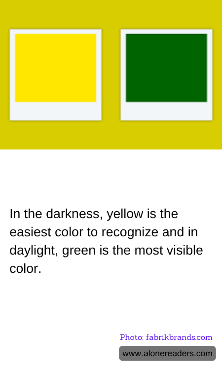
In the fascinating world of color perception, the visibility of colors can vary significantly depending on the lighting conditions. This intriguing phenomenon is rooted in the way human eyes perceive different wavelengths of light. In the darkness, yellow emerges as the easiest color to recognize, while in daylight, green stands out as the most visible color. Understanding these differences not only enhances our appreciation of color but also has practical applications in design, safety, and communication.
The human eye is a marvel of biological engineering, equipped with photoreceptors known as rods and cones. Rods are more sensitive to light and are primarily responsible for vision in low-light conditions, while cones are responsible for color vision and function best in bright light. In dim lighting, the rods take over, and their sensitivity to shorter wavelengths makes yellow the most distinguishable color. This is why yellow is often used for emergency vehicles, road signs, and safety gear, as it can be easily recognized even in low visibility conditions.
Conversely, during daylight, the cones in our eyes are more active, allowing us to perceive a broader spectrum of colors. Among these, green is the most visible due to its position in the middle of the visible light spectrum. This central position means that green light stimulates both the long and medium wavelength cones in our eyes, making it appear brighter and more vibrant than other colors. This is why green is often used in environments where visibility is crucial, such as in traffic lights and safety signals.
The practical implications of these color perceptions are vast. In the realm of design, understanding how colors are perceived in different lighting conditions can influence everything from fashion to interior design. For instance, choosing the right color for a room can affect mood and functionality, with yellow being a popular choice for spaces that require alertness and energy, while green is often used to create a calming and refreshing atmosphere.
In safety and communication, the strategic use of yellow and green can enhance visibility and convey important information quickly and effectively. Emergency services and construction industries rely on high-visibility clothing and equipment to ensure the safety of workers and the public. Similarly, in nature, many animals and plants have evolved to use these colors for survival, with bright yellows and greens serving as warnings or camouflage.
In conclusion, the visibility of colors in different lighting conditions is a testament to the complexity and adaptability of human vision. Whether in the darkness or daylight, the strategic use of yellow and green can significantly impact our daily lives, from enhancing safety to improving design aesthetics. By understanding these principles, we can make more informed choices in various aspects of life, ensuring that we communicate effectively and create environments that are both functional and pleasing to the eye.