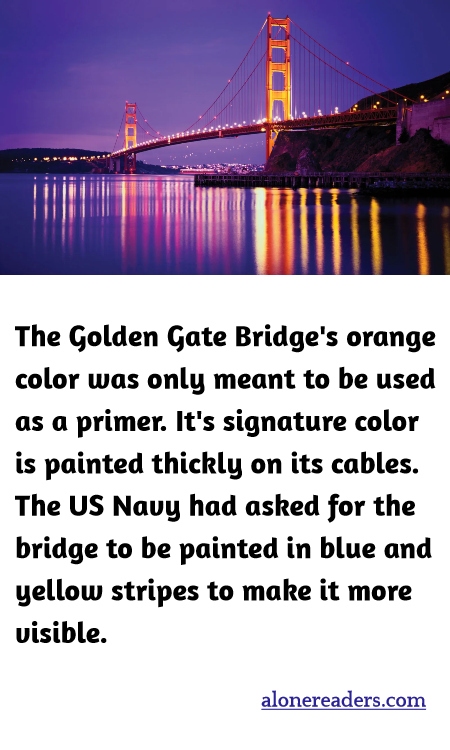
When the Golden Gate Bridge was being planned, its color was a subject of significant interest and debate. Contrary to popular belief, the vibrant orange hue that it's famous for was originally intended to be only a primer. Known as "International Orange," this color was selected because it blends well with the natural surroundings and enhances the bridge's visibility in the foggy conditions that often engulf the area.
The suggestion to paint the bridge orange was made by Irving Morrow, the consulting architect, who was struck by the striking reddish-orange primer used to protect the steel components. Morrow argued that this color was not only practical for visibility but also aesthetically pleasing, complementing the blue water and green landscape of the San Francisco Bay.
Interestingly, the U.S. Navy had different ideas about the bridge’s color scheme. Because of the strategic importance of the bridge and the need for high visibility during foggy conditions, the Navy recommended that the bridge be painted in bold stripes of blue and yellow. This was intended to ensure that the bridge would stand out against the backdrop of sea and sky, theoretically reducing the likelihood of ships colliding with it.
Ultimately, the Navy's suggestion was overruled, and the original orange color was retained. This decision was aided by the support from the public and the persuasive arguments of Morrow who favored the continuity of the unique International Orange. This color not only provides visibility in the fog but is also a preservative, which is ideal for the marine environment of the San Francisco Bay.
The signature International Orange color is not just slathered on superficially; it is a vital part of the bridge's maintenance and aesthetic appeal. The paint applied on the Golden Gate Bridge is indeed thick, especially on its massive cables, to protect it from the corrosive elements of the sea and wind. Regular maintenance ensures that the color remains vibrant and the bridge stays structurally sound.
The decision to keep the bridge orange has made it one of the most photographed and iconic structures in the world, celebrated not just for its engineering marvel but also for its striking appearance. This color choice did, indeed, turn out to be a navigational aid, as well as a fitting symbol for the bold, pioneering spirit of the area. The iconic status of the Golden Gate Bridge serves as a reminder that sometimes, initial insights in design can serendipitously result in lasting, impactful outcomes.