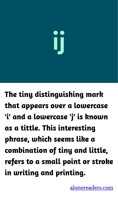
The tittle, a term quintessential to the nuances of typographic terminology, may seem like an insignificant speck when considering the larger framework of written language. However, it actually holds vital importance, especially when distinguishing between characters. Positioned snugly above the lowercase 'i' and 'j', the tittle carries a function that goes beyond mere decoration, entering the realm of essential linguistic symbols. Originally, in Latin manuscripts, these letters were written without any distinguishing marks, leading to potential confusion in legibility. Over time, as language systems evolved and printing technology sought to enhance both clarity and aesthetics, the tittle became a standardized feature.
This not only set the groundwork for more precise communication but also paved the way for the development of unique fonts and styles in typography, where the tittle could be manipulated to add character and identity to the text. In modern typography, the style and placement of the tittle can vary markedly between different fonts. For example, in some typefaces, it may be square, round, or diamond-shaped, and its position can subtly affect how letters are perceived in terms of alignment and spacing. Moreover, in the realms of branding and logo design, designers often modify the tittle to create a distinctive visual identity for a brand, showcasing how these minute components can be harnessed creatively.
Despite its small size, the omission of a tittle can lead to misunderstanding in written communication. For instance, uncarefully handwritten or poorly printed texts can transform an 'i' into an 'l' or a '1', particularly in sans-serif fonts which might feature very similar shapes. Thus, the functional prowess of the tittle extends into areas of design ergonomics, ensuring texts are user-friendly and accessible. Recognition of such tiny details, like the tittle, enhances our appreciation for the complexities of written text and the thoughtful intricacies that go into every aspect of its creation. As we continue to develop our understanding and usage of text, the tittle stands as a testament to the meticulous craft of language and the communicative power held even in the smallest marks.