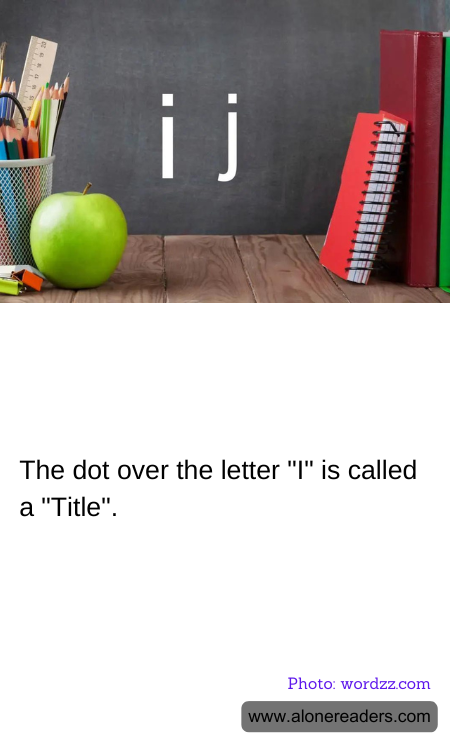
The small dot over the letter "i" and the letter "j" in English and many other languages is known as a "tittle." The term originates from the Latin "titulus," which means a heading or an inscription. The tittle serves not only a decorative function but also plays a crucial role in the readability and distinction of characters.
In the evolution of writing, the tittle has an interesting history. Its introduction dates back to medieval manuscripts, where minuscule writing (lower case letters) began to use dots above these particular letters to differentiate them from similar pen strokes of other letters, such as "n" or "u." As script styles and typesetting practices evolved with technology, the tittle remained an essential part of these letters' overall form.
In modern typography, the style and positioning of the tittle can vary depending on the typeface. Some fonts may display the dot as a perfect circle, while others might have it square, diamond-shaped, or even heart-shaped in more ornamental designs. The positioning can also shift slightly, impacting readability and aesthetic appearance.
Furthermore, the tittle's presence or absence can be a deliberate stylistic choice in graphic design and artistic typography. In certain minimalist styles, designers may omit the tittle to give a clean and sleek appearance, although this can potentially reduce legibility.
Overall, while small and often overlooked, the tittle is a significant element of written language, contributing to both the function and beauty of typographic design. Whether ensuring clarity in everyday writing or adding a distinct touch to specialized projects, the tittle plays an integral role that belies its diminutive size.