It's common knowledge today that Amazon is a major force in the development of a wide variety of technology, rather than merely a retailer. Amazon Alexa, a voice-activated personal assistant, and cutting-edge drone technology are just two examples. How far has Amazon come since its inception? Let us take a little but extremely prestigious stroll through the history of Amazon, starting with the creation of the Amazon logo and moving forward to the present day.
In 1994, Jeff Bezos launched Amazon under the moniker Cadabra. Bezos realized a year later that the company's original name sounds similar to "cadaver," so he changed it to "Amazon" as a testimony to the value of careful branding. In its early days, Amazon's only product offering was books. In its first two months online, Amazon sold books in 45 countries and made $20,000 every week. They have just acquired a patent on 1-click purchasing, which they license to Apple.
Logos of Amazon
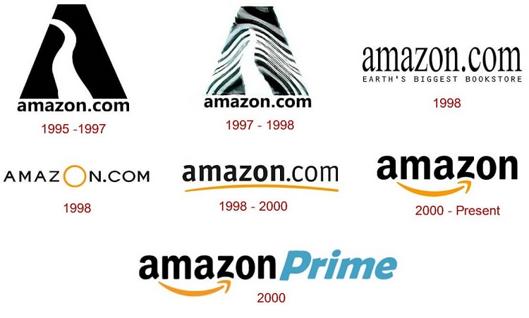
The First Logo in 1994
Amazon's early logo looked quite different from the current one. In 1994, the Amazon logo was a capital letter A with a river winding through it. The words "Earth's largest bookshop" were written underneath the logo. When it first opened in 1994, it was only a bookshop, but things were about to change. Water effects were used across the board in the logo to set Amazon apart from the competition. Turner Duckworth was commissioned by Jeff Bezos to develop the first Amazon logo.
New Logo in 1998
In 1998, the logo underwent a major redesign that brought it considerably closer to the Amazon logo we know today. There was a sign reading "books, music &more" above the word amazon, and the line below the amazon word was longer and golden. The previous logo wasn't as well-liked as this new one.
A to Z Arrow in 2000
There was a minor update to the Amazon logo in 2000 compared to the version from 1998. The logo included the Amazon website's domain (amazon.com), but the arrow was shortened to join the letters a and z. This gave the emblem more significance by suggesting that the site covered every topic imaginable, from A to Z.
The Current Logo in 2002
The logo that was in use in 2000 looked quite similar to the current design, although there were a few key changes. The message "and you're done" was added to the logo's bottom left in 2002. Since then, this logo's popularity has only increased, and it remains in use to this day.
There have been several different Amazon logos used in its history. Today's Amazon emblem is intended to convey unequivocally that the company offers every conceivable product. The arrow below the logotype is meant to represent the joy that customers will feel when using the company's online store.
Amazon Logo Arrow
To most people, the most recognizable aspect of the Amazon logo is the arrow that runs from the letter A to the letter Z in the company's name. This arrow is bold and slightly curved, giving it the appearance of a smiley face.
Amazon Logo Color
Back in the day, Amazon's logo was only available in black and white. The brand adopted the vibrant orange color as part of an effort to modernize and become more approachable. Amazon's Prime logo, as well as the logo for the Amazon app, both use blue.
Amazon Logo Font
The Amazon logo, it has been determined by experts, uses the sans serif Officina sans bold font. This font style has undergone a few modifications, however. There is no other company besides Amazon that uses a Z with a curved bottom.
It is difficult to argue against the significance of the Amazon logo emblem, regardless of whether or not you are a supporter of the company. At this point in time, everyone is aware of the one-of-a-kind arrow in the Amazon emblem that connects A to Z.
The positive attitude that permeates Amazon has had a role in the development of many aspects of the organization. For instance, the corporation maintains the Smile Charitable Program, which is in charge of distributing monetary contributions to a variety of important organizations located all over the globe.
“The Most Centered Company in the World” – Amazon’s slogan.
It will attempt to locate anywhere the user wants to look and whatever it is they are looking for online, all while offering the best deal available. The usage of the phrase "Our mission is to be the most customer business, establishing a location where people can locate and find whatever they may wish to purchase online" is another point of interest.
Not sure if this is an official slogan, but their corporate office is full of this motto:
“Work Hard, have fun, Make History “
Amazon is a very forward-thinking and innovative firm. Amazon has always aspired to be a place where amazing things take happening, and its motto embodies those goals. They are looking for individuals who are dedicated to their profession, who take pleasure in their employment, and who want to achieve great things in their lives. This is an admirable goal for any firm, and the phrase is tailor-made for Amazon's business model.
Making history- It serves as a constant reminder of the immense value delivered by Amazon and its staff. The changes that the Amazons introduced to literature are often forgotten. As a result, they are able to dominate their industry and continue to grow by branching out into other products and selling their thriving business platform. Never activate streaming services like Amazon Video or Netflix by activating a Kindle, Fire TV, or Echo. We are eagerly anticipating Amazon's next big thing.
Amazon's logo is on every shipment they ship. Amazon promises that they "bring smiles to consumers' doorsteps" with every shipment. Customers reuse Amazon boxes to mail other things, promoting the business. It's one of the best ways Amazon uses their logo and shows how packaging affects branding.
A good logo leads to fantastic slogans, and Amazon has crafted one of their greatest around their logo. Amazon's smile program, a charity branch that contributes money to a number of causes, is another example of how the corporation has created its image around its logo.
Amazon is one of the most intriguing firms to examine, and it will be interesting to watch what advancements they lead in the next years. Amazon, a relatively young firm compared to Walmart and Target, has opportunity to define its identity. It will be fascinating to watch how they employ their emblem in their distinct branding approach moving ahead.
The Amazon logo is simple and adaptable, with two distinct meanings. It's a fantastic illustration of how a single graphic element (the arrow) can evolve into something more than just a logo. A smiley Amazon has become as recognizable as the company's logo thanks to strategic placement.
January 02, 2025

October 25, 2023

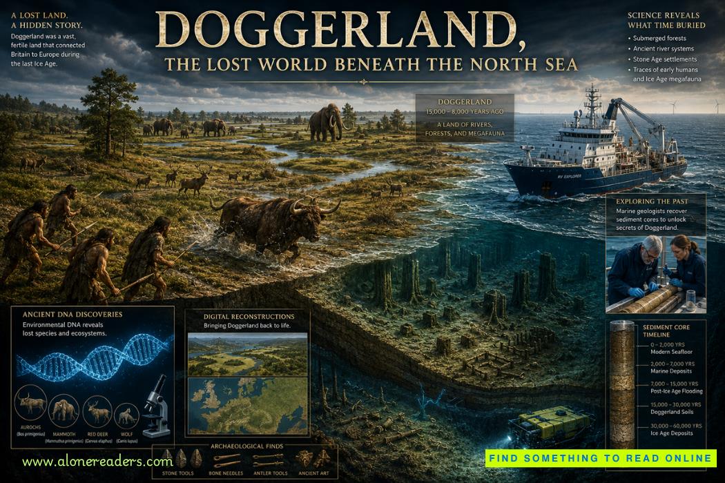 Doggerland Lost World: The Sunken Heart of Ice Age Europe
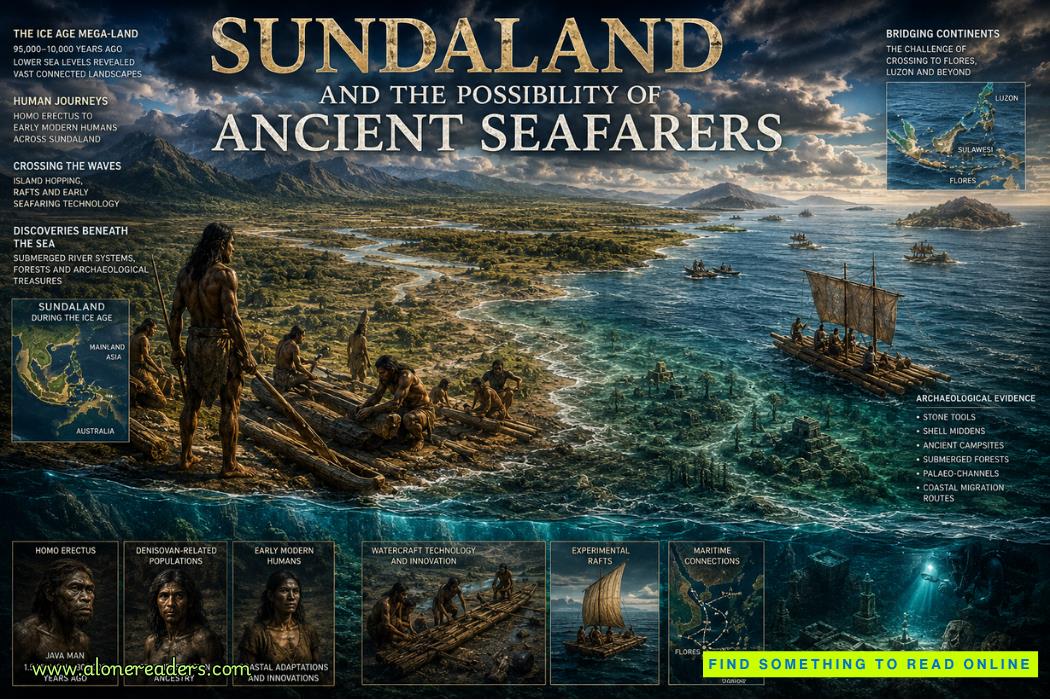 Sundaland Sunken World: Ancient Seafarers Before History
 New Deep Sea Species Found in the Clarion-Clipperton Zone
 LiDAR Lost City Discoveries Explained
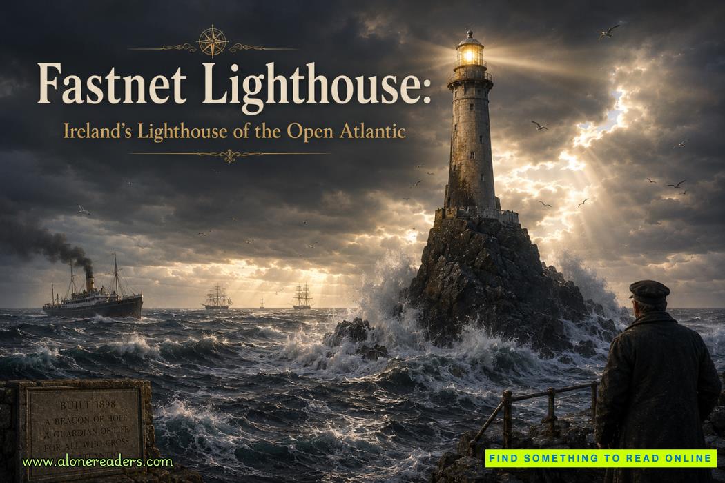 Fastnet Lighthouse: Ireland’s Lighthouse of the Open Atlantic and Guardian of the Western Seas
 Heceta Head Lighthouse: Oregon’s Scenic Coastal Landmark and Maritime Beacon
 Australia Student Visa Subclass 500: GTE 2026 Complete Guide for Successful Applications
 UK Religious Worker Visa: Temple Sponsorship Guide for 2026
 S Pass Singapore Work Visa Quota 2026: Complete Employer and Applicant Guide
 UK Global Talent Visa Endorsement Process 2026: Complete Guide for Applicants
 Tatya Tope and the Guerrilla Warfare Campaign Against the British: The Mobile Resistance of 1857–1859
 Legacy of the Mughal Empire: Politics, Culture, and Historical Impact on South Asia
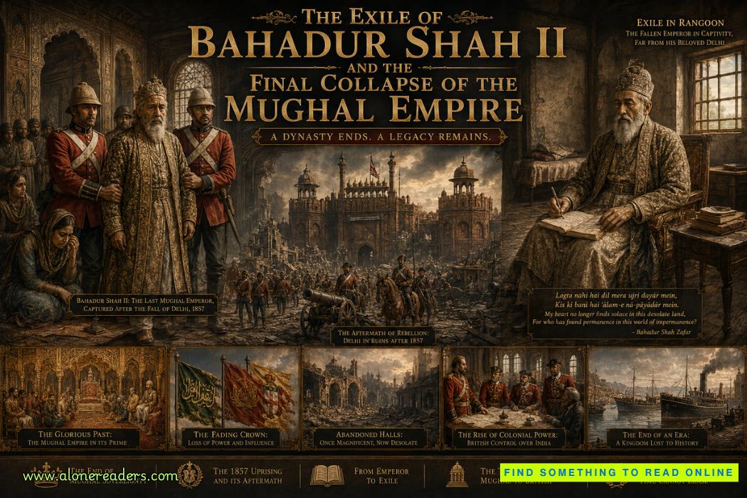 The Exile of Bahadur Shah II and the Final Collapse of the Mughal Empire
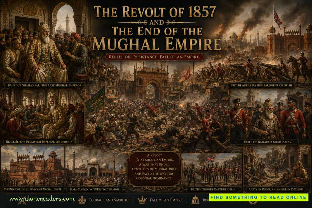 The Revolt of 1857 and the End of the Mughal Empire: The Final Collapse of India’s Great Dynasty
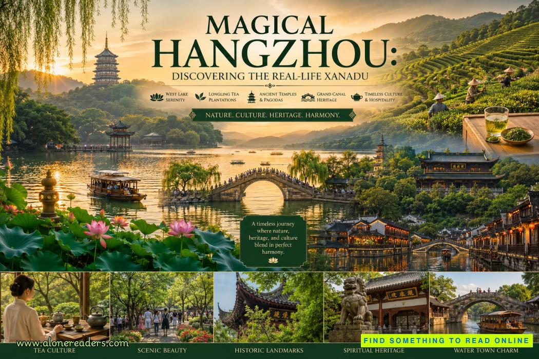 Magical Hangzhou: Discovering the Real-Life Xanadu of China
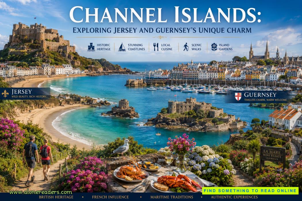 Channel Islands: Exploring Jersey and Guernsey’s Unique Charm, Beaches, and Heritage