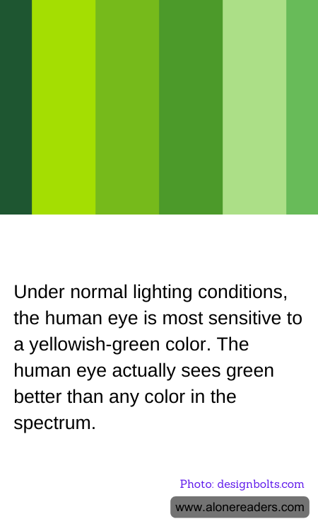
The human eye exhibits a unique sensitivity to particular colors in the light spectrum, most notably to a shade of yellowish-green. This heightened sensitivity is not arbitrary but is deeply embedded in the biology of our visual perception mechanisms. The main rationale behind this phenomenon is the construction and distribution of cone cells in the retina. Humans possess three types of cone cells, each responsive to different wavelengths of light: long (L), medium (M), and short (S) wavelengths, corresponding broadly to red, green, and blue light, respectively.
The peak sensitivity of the human eye lies around 555 nanometers in the visible light spectrum, which corresponds to the yellowish-green region. This specific area of the spectrum is where daylight sunrays are most intense, and evolution has likely fine-tuned human vision to be most effective under the natural lighting conditions we have been exposed to for millennia. During daytime, when human visual activity is at its peak, this sensitivity to yellowish-green light helps in distinguishing a myriad of shades in our environment, contributing significantly to tasks that require acute visual discrimination such as identifying fruits, leaves, or threats in a natural setting.
Furthermore, this preference plays a crucial role in safety and sign recognition. Many safety signals and signs, such as those found on emergency exits, fire equipment, and high-visibility clothing for roadside workers, are rendered in luminous green or yellowish-green. This design choice is made to leverage the human eye’s natural peak sensitivity, ensuring that such signals draw immediate attention and are clearly discernible even at a distance or in peripheral vision.
Understanding this aspect of human vision also aids in enhancing technological interfaces and displays. Devices are often fitted with screens that minimize harsh blues and maximize greens and yellows, catering to our eyes’ preferences and reducing strain. This knowledge is crucial for designing user-friendly interfaces that conform to natural human vision capabilities, thus improving user experience and efficiency.
In essence, our eyes' favoritism toward yellowish-green is a testament to both evolutionary biology and practical necessity, influencing everything from the safety codes we follow to the digital interfaces we interact with daily. As such, this particular color preference is integral not only to our survival and functionality in natural settings but also across numerous modern day applications where visual clarity and attention are paramount.