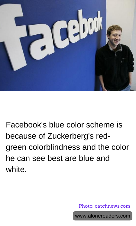
When designing the now iconic look of Facebook, Mark Zuckerberg, the company’s co-founder, selected a color scheme that reflects his personal vision in more ways than one. Zuckerberg is red-green colorblind, which means that the colors he can see the most clearly are blue and white. This influenced his decision to choose blue as the dominant color for Facebook.
The choice of blue not only caters to Zuckerberg’s visual clarity but also benefits the design of the platform in several ways. Psychologically, blue is a color that suggests depth and stability. It is also associated with trust, calm, and professionalism, traits that are desirable for a social network that wants to appeal to a broad audience. Furthermore, blue is a color that contrasts well against white, making the text and other elements on the website easier to read. This contrast ensures that users can navigate the site comfortably, thereby enhancing user experience.
Facebook’s blue and white color scheme has become one of the most recognizable in the digital world. Despite minimal updates and tweaks over the time, the fundamental colors have remained consistent. This choice not only reinforces the brand's identity but also subtly enhances usability. Zuckerberg’s pragmatic approach to solving a personal limitation has inadvertently crafted an aesthetic that millions of users find appealing and easy to use.