In the world of typography, the term "font" is often used interchangeably with "typeface," but this common usage belies a more nuanced distinction that has its roots in the history of printing. Understanding the difference between these terms can enrich our appreciation of the written word and the design choices that shape our reading experiences.
Traditionally, a "font" referred to a specific set of characters within a typeface, encompassing variations such as bold, italic, or regular. Each of these variations was considered a separate font. For instance, within the typeface family of Times New Roman, Times New Roman Bold and Times New Roman Italic would each be distinct fonts. This distinction originated in the era of metal type, where each font was a complete set of metal pieces used to print in a particular size and style.
On the other hand, a "typeface" is the overarching design that defines the visual appearance of the characters. It is the artistic creation that gives a cohesive look to letters, numbers, and symbols. A typeface can include multiple fonts, each representing a different weight, style, or size. For example, Arial is a typeface that includes fonts like Arial Regular, Arial Bold, and Arial Italic. The typeface is the creative vision, while the fonts are the practical tools used to bring that vision to life in various contexts.
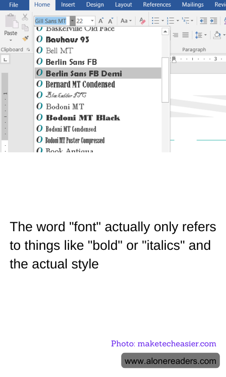
In the digital age, the distinction between font and typeface has blurred, largely due to the convenience of digital typography. Software programs often use "font" to describe what is technically a typeface, leading to widespread confusion. However, understanding the original definitions can enhance our appreciation of typography as both an art and a science. It highlights the meticulous work of typographers who craft typefaces to convey specific moods and messages, and the role of fonts in adapting these designs for different uses.
For designers and typographers, the choice of typeface and font is a critical decision that affects readability, aesthetics, and the overall impact of the text. A well-chosen typeface can evoke emotions, establish a brand identity, or guide the reader's eye through a page. Meanwhile, selecting the right font within that typeface can emphasize key points, create visual hierarchy, or simply make the text more legible.
In conclusion, while the terms "font" and "typeface" are often used interchangeably today, understanding their distinct meanings can deepen our appreciation for the craft of typography. It reminds us that every piece of text we encounter is the result of thoughtful design choices, each contributing to the way we perceive and interact with written content. Whether you're a designer, a writer, or simply a reader, recognizing the difference between a font and a typeface can enhance your engagement with the world of letters.