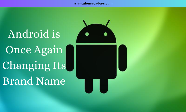
Over the course of the past few years, there has been a significant shift toward a cleaner and more streamlined appearance for Android. And as a result of Android's ongoing transformations, the operating system's brand identity has also evolved throughout the years. Over the course of its history, Android has seen a number of revisions to both its logo and its brand identity; nonetheless, the iconic bug droid has always been present in Android's marketing materials. The most recent modification took place in 2019 and it consisted of Google using a typeface that had been significantly modernized in addition to merely the bug droid’s head. We're used to seeing a new logo once every few years or so and if you were concerned that Google would be content with the one it has right now, you shouldn't be. Google will not be settling with what it has right now. Google is now in the process of rebranding Android once more and this time around, the company is opting for a far more radical look in comparison to what we've seen in the past.
According to 9to5Google, Google's Android operating system will soon debut a redesigned logo that is intended to bring the Android brand into the twenty-first century. This bug droid head will continue to be used, but it will no longer have the decreased flat shape it formerly had. Alternately, for a change, it has the appearance of being three-dimensional, complete with shadows and light reflections on it. It has a lot of similarities to the robot head that is already in use, but it manages to differentiate itself in a much more striking manner thanks to the additional effects.
Another significant alteration was made to the font and its use. In contrast to Android's traditional logo, which has been written entirely in lowercase since it was introduced in 2008, the new Android logo features an uppercase version of the letter A rather than writing it out entirely in lowercase. The typeface itself appears to have undergone some subtle alterations as well, however, to tell you the truth, the one thing that you are almost certainly going to notice right away is the brand-new capital A.
Ever since CES 2023 came around, Google has been playing around with this new 3D droid, despite the fact that it was still presented alongside the older Android typeface. It displayed its presence once more during the I/O 2023 conference. Now, the new logo is appearing in advertisements for Android and Google apps on Samsung mobile devices such as the Galaxy S23 Ultra and Flip 4. The following was confirmed by Google in a statement that was sent to 9to5Google on the recent change in the company's corporate identity: “I am not going to say that it has a terrible appearance, but after being exposed to the Android logo with lowercase letters for more than a decade, the capital letter version appears quite strange to me. I'm not going to say that it has a terrible appearance. Nevertheless, there's a chance that I'll come to appreciate it in time. Who could possibly say?”

October 25, 2023

January 02, 2025

 AI Video Generators in 2026: How Creators Are Replacing Traditional Editing
 Anthropic vs OpenAI: Diverging Compute Economics, Cash Burn, and the Fight for AI Profitability
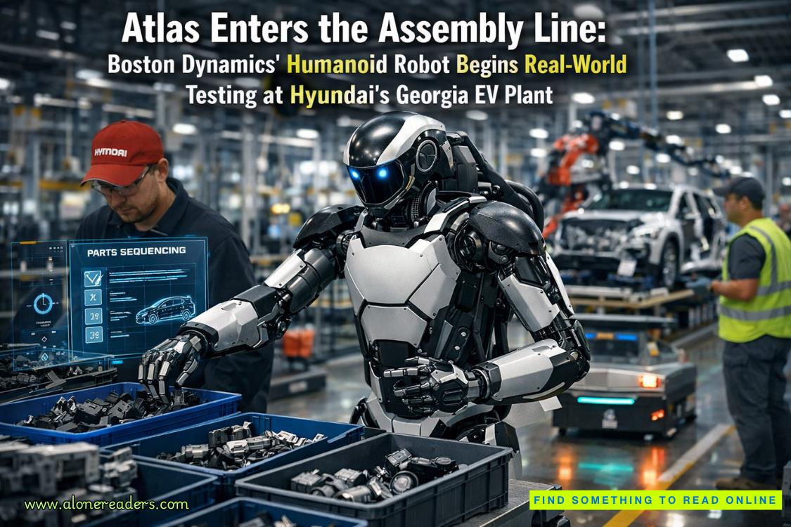 Atlas Enters the Assembly Line: Boston Dynamics’ Humanoid Robot Begins Real-World Testing at Hyundai’s Georgia EV Plant
 China’s Rapid Data Center Boom: Is Beijing Outpacing the US in the Global AI Infrastructure Race?
 5G Revolutionizes Supply Chain Automation: Manufacturing Enters a New Era of Precision and Profitability
 GPT-4.1 vs Llama 4 Maverick vs Gemini 1.5 Pro: Who Really Leads in Reasoning, Multimodality, and Speed in 2025?
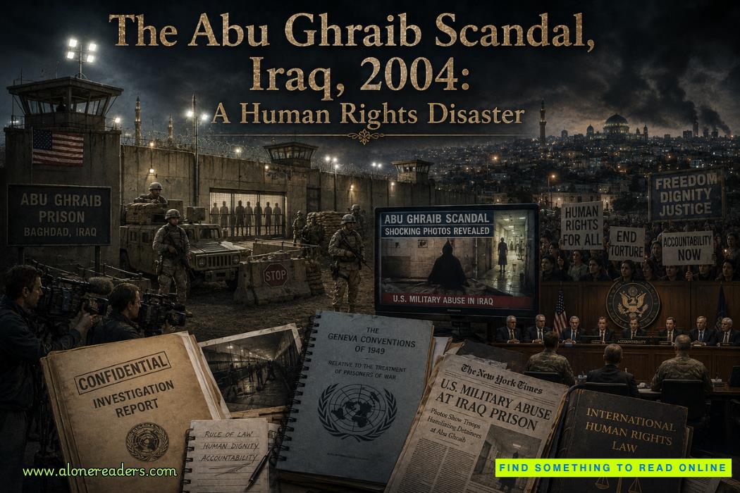 The Abu Ghraib Scandal, Iraq, 2004: A Human Rights Disaster That Shook the World
 The Disbanding of the CNRP, Cambodia, 2017: Hun Sen's Clampdown on Democracy and the Reshaping of Cambodian Politics
 The Firing of James Comey, United States, 2017: Trump's Controversial Decision Amid FBI Investigation
 The Rwandan Refugee Crisis, Central Africa, 1994: Aftermath of Genocide and the Humanitarian Catastrophe
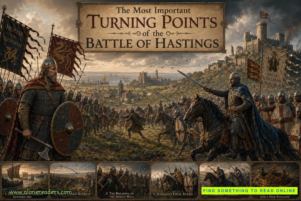 The Most Important Turning Points of the Battle of Hastings (1066)
 Why William Won the Battle of Hastings and Harold Lost: Strategy, Leadership and Fate in 1066
 How King Harold II Died: Facts, Myths, and Historical Debate
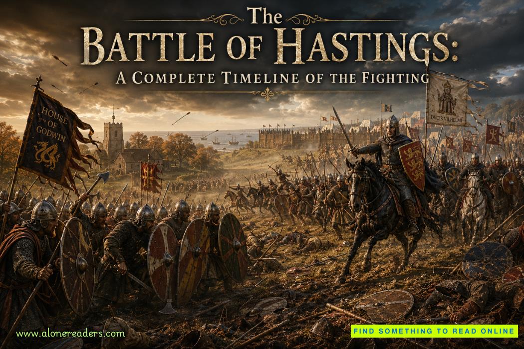 The Battle of Hastings: A Complete Timeline of the Fighting
 High-End Talent Category A Work Permit China 2026: Complete Eligibility, Benefits, Application Process, and Expert Guide
 Cultural Activities Visa Japan 2026 Guide: Complete Eligibility, Requirements, Application Process, and Expert Tips